The Logbook App
My role
The redesign of the app, enhancing features and implementing a comprehensive design system to elevate user experience while boosting activation and conversion rates.
A Year of Thoughtful Design and Iterative Development
Creating the Logbook app was a comprehensive project spanning an entire year of in-depth research and meticulous design. We approached this project with a user-centric mindset, breaking down the extensive feature set into manageable stories and addressing them through focused sprints.
Our process began with building the core functionalities, which we rigorously tested and refined. Each iteration was informed by user feedback and usability testing, ensuring that every feature added genuine value.
Standout Feature: Quick Trip Categorization
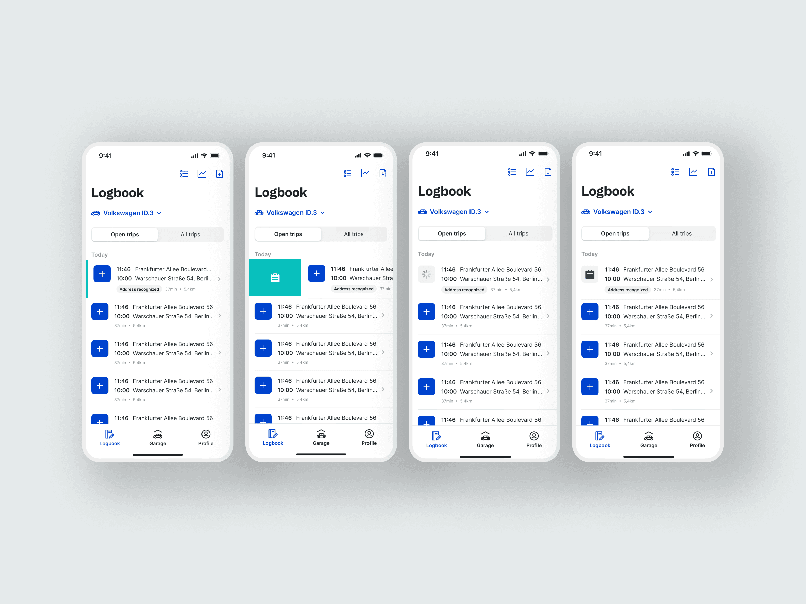
One valuable feature for our users is the quick categorization of trips, helping them save on taxes by easily marking business trips. Our research and discovery led to a seamless process, greatly enhancing user experience.We also analyzed features from the previous app version, identifying opportunities for improvement and strategically sunsetting features that no longer met user needs.
Hypothesis
What do Prosumers expect from the new Logbook?
Simple overview of the open tasks
Quick and easy completion of the necessary tasks to keep the logbook tax compliant
Small amount of time needed to complete tasks
Automation of processes and support in the completion of tasks
Automatic compliance with tax office regulations in order to have the documents at hand at the end of the year
User Research


Research Learning
The key value of our product is rapid categorization, and we aim to make it even faster whenever possible. I have brainstormed numerous ideas and tested them using the Maze app.
Mainly I tested a the swipe to categorize, and another hold to categorize, the Swiping felt better to the users, but we decided to develop both methods to improve engagement even more.
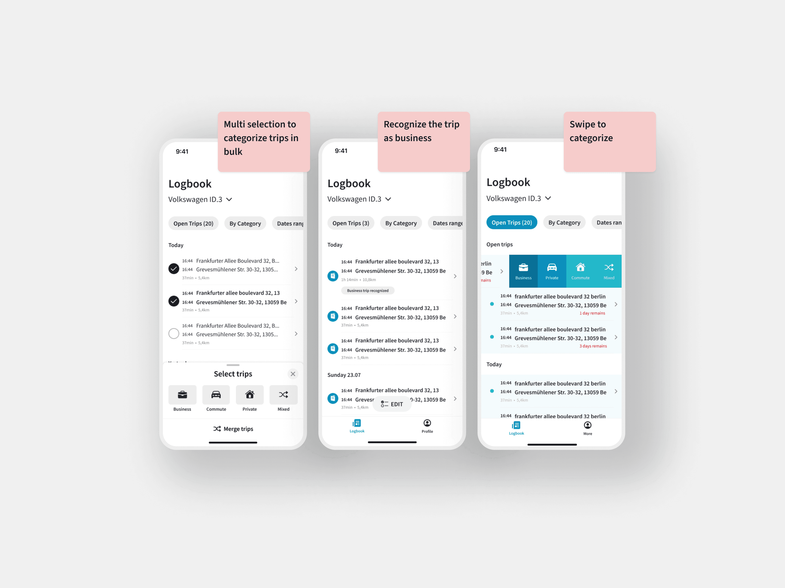

Innovative bulk categorization for enhanced UX
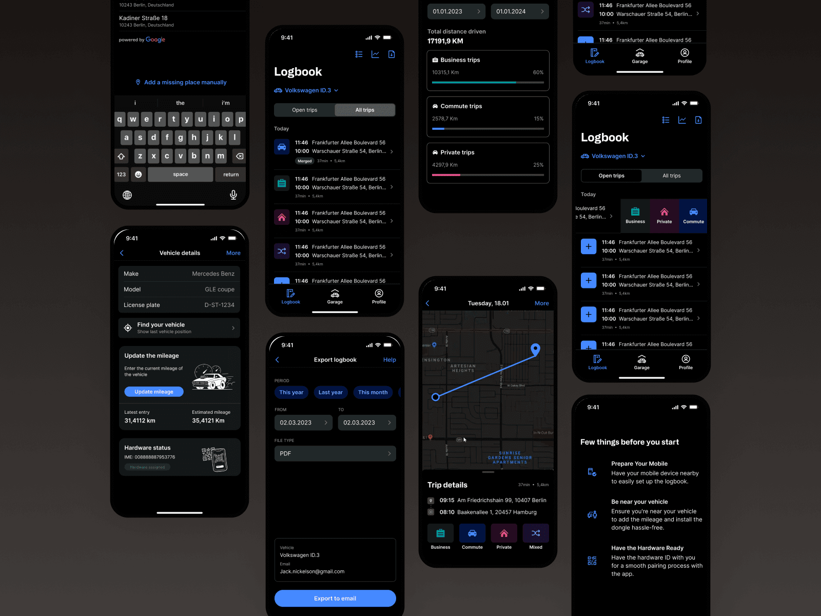
Our initial idea focused on bulk categorization to streamline the user experience. By observing how drivers merge small trips or categorize multiple trips as business-related, we identified the need for efficient selection options. Users can now select consecutive trips or all trips within a specific day, ensuring a smooth and rapid categorization process. We also ensured that the multi-select feature remains legally compliant and informative, minimizing errors and preventing mistakes during categorization.
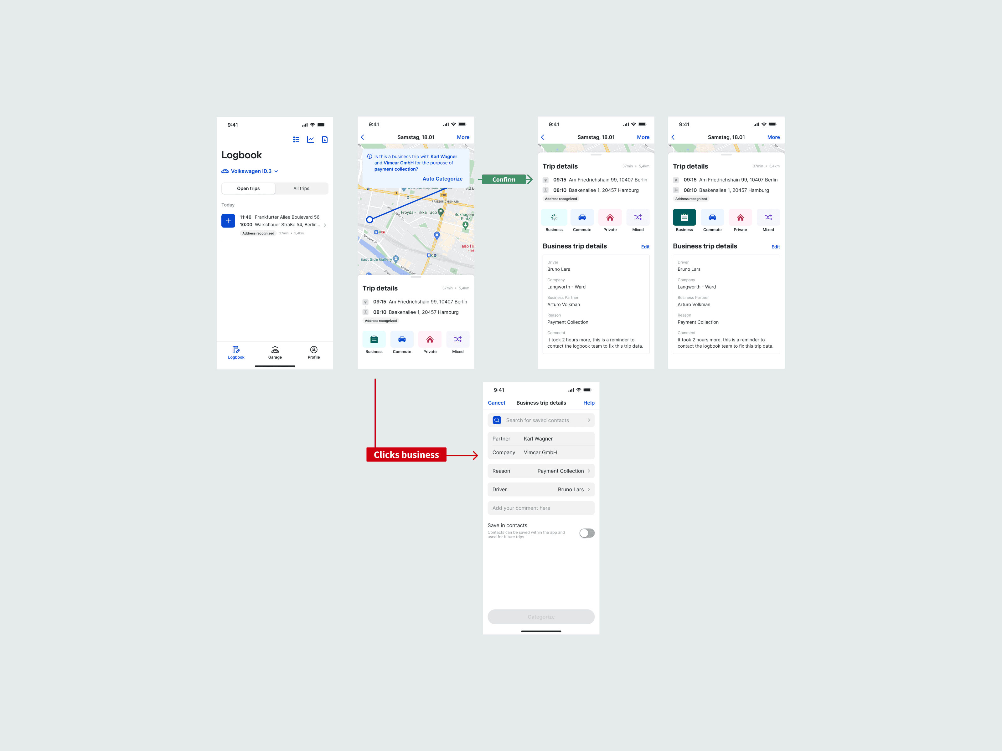
Another significant finding was the implementation of swipe to categorize. Our research led us to merge two concepts: long press and swipe to categorize. The most impactful improvement was the app's ability to identify the driver's address and suggest the appropriate category, enhancing the overall efficiency and user experience.

Further customer testing and optimization
Through further testing with our customers, we discovered ways to accelerate the categorization tasks even more. By introducing a "swipe right" feature to categorize business trips, we enabled users to quickly identify business trips. Additionally, when the app recognizes a trip as business-related, it can automatically detect the location, business partner, and reason for the trip. This enhancement ensures that users never miss an opportunity and can maximize their tax savings and profits.
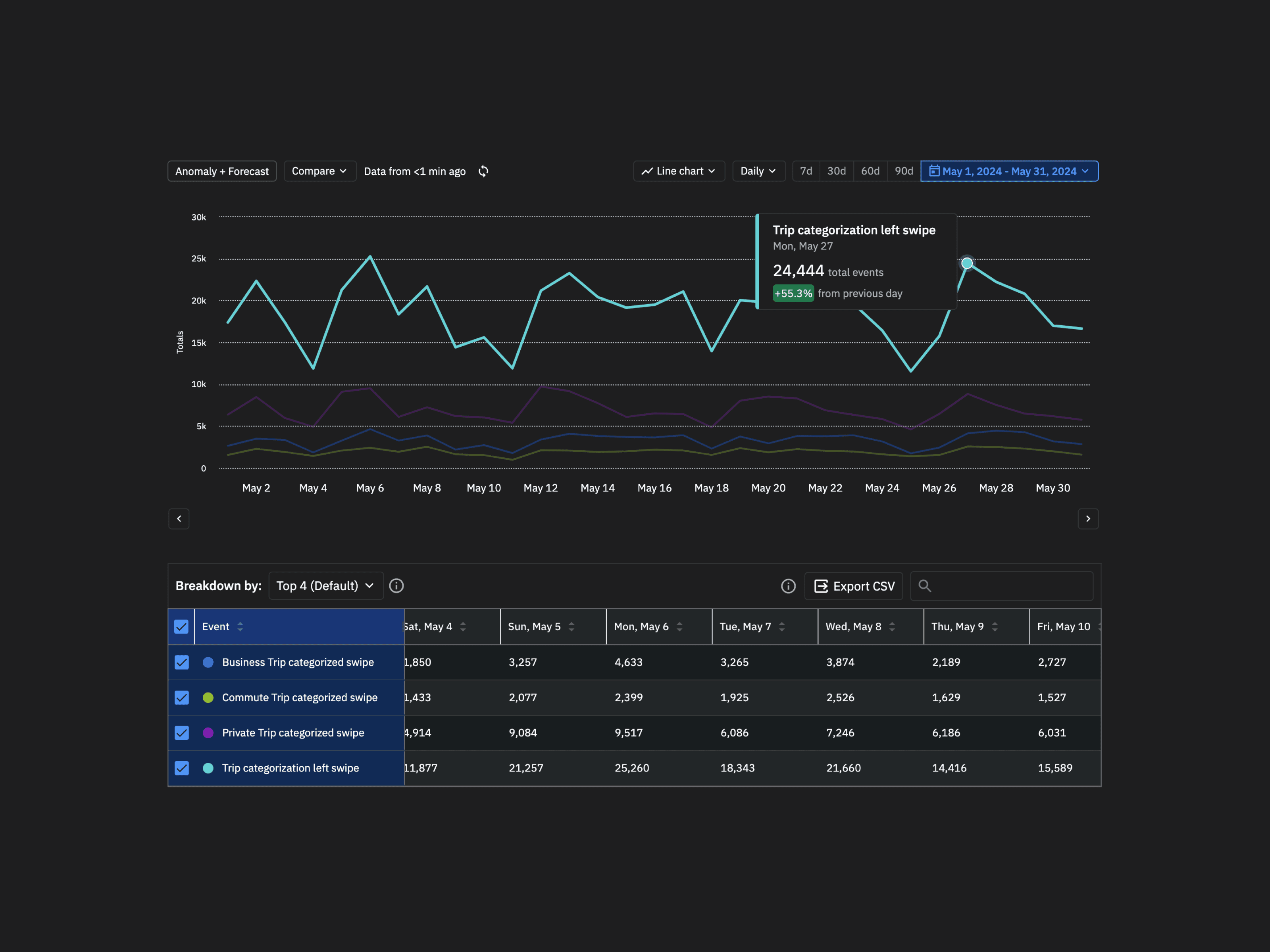
In the last 90 days about 9% of trips have been categorized by quick categorisation (971k quick categorisations out of 9.6M categorisations overall) . Those numbers were enough to see that the users are adopting to a quick categorizing, and it meant that the pattern will keep improving in the next quarters. Mission accomplished!

App showcase
Below are some images of the app, highlighting the various features, visual language, and solutions we developed over the course of a full year.